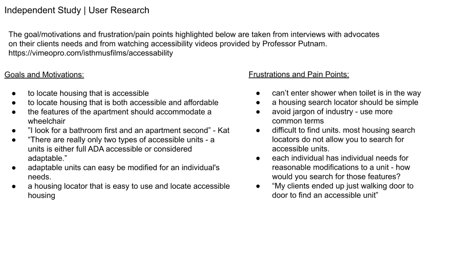
How might we rethink a statewide affordable housing locator in a way that caters to lower-income households and persons seeking housing with special features, such as accessibility or supportive services?
Illinois Housing Locator
The official housing locator for the state of Illinois is http://ilhousingsearch.org. While the current site offers users a few necessary search features, it suffers from numerous usability issues. The site has cumbersome forms, poor search capabilities, legibility problems, inadequate photo display and does not allow for users to save their searches or create a user profile. The goal of this project was to conduct a user evaluation and then define usability and design recommendations to inform a potential redesign of the Illinois housing search site, www.ilhousingsearch.org
Overview
Role: UX Researcher
Duration: 10 Weeks
Tools: Pen and Paper (sketches), Sketch (wireframes), Prototype (InVision) Google Docs (Navigation Map, Comparative Analysis, Personas, User Testing and Final Analysis)
Methods: sketching, literature review, navigation map, comparative analysis, personas, prototyping, and evaluation
Process
In an effort to gain understanding and insight into the usability of www.ilhousingsearch.org, I selected three users to observe the task of selecting an apartment. The users were instructed to visit the website, select a place they would like to search for an apartment and filter for features of an ideal apartment (bedroom size, cost, location). Each user had never utilized the site prior to testing and were of varying technical skills (self defined). After they were completed with their housing search, I asked each user four main questions: Were there any design errors; Were there any functionality errors, what is necessary but not included; and what would be helpful but not included in the site?
It is important to highlight that two out of the three users suggested photos as “missing but helpful and all three users defined the map feature as “missing but necessary”.
“A map with available housing can help those looking for housing identify amenities (i.e. transit / expressway access). Domu.com does a good job. There is a link to a google map which is helpful but only at the property level. No way to get a bird’s eye view of available units. This isn’t very efficient since housing seekers will need to either enter zip code or city name. Potentially missing opportunities if they don’t know the zip of neighboring communities or the community name. ”
Another common error included the inability to edit the filter without returning to the homepage. This appeared to be highly frustrating for each user. “When you search a place (ie. Oak park) and there are zero properties available, you have to then go back to the home screen in order to search again.” - AJ
The design of the website was also mentioned as needing to be “modernized”. While two of three users suggested color upgrades and overall look and feel. Diana mentioned the inability to see the icons due to the size. “The Icons/Legends (ie. Accessibility Features, No Smoking etc) are too small to see.” - Diana
Overall, each user was able to complete their task but also mentioned they experienced a high level of frustration and felt that the overall site could be simplified to improve the quality of their searches.
In addition to evaluation users, I conducted a content audit of the current site. For example, the Home page alone has 29 links. Six of those links send users to the same county and city search page, eight of those links send the user an identical login screen, and there are three different ways to link to the “helpful tools”.
The user evaluation and the content audit both suggest that there is a real need for a re-design of the site’s information architecture and overall ease of use.
Navigation Map
To provide suggestions on how the site’s architecture could be improved, I created a navigation map and a low-fidelity prototype to test the basic functionality.
Prototype
Hi-Fi Prototype
Project Impact
The user research conducted in this project was used to inform the current live sight redesign. The vendor has updated some the sites usability and focused primarily on consistent concerns about a search bar on the homepage, ability to search by specific accessibility features, and mapping search results. While a work in progress, we continue to work with our vendor to make design updates and decisions that are user focused and directly benefit the residents searching for affordable and/or accessible housing.
2018 Updated ILhousingsearch.org


